
A beautiful website can still fail, and most of the time it does so quietly, without obvious warning signs until the results start slipping.
You can invest heavily in visuals, refine every detail, and still watch users lose interest within seconds of interacting with it. The problem is not how it looks, but how it works when real people try to navigate it.
When journeys feel confusing, slow, or disconnected, users don’t wait, they leave. And they rarely come back. At Big Bash Studio, we see this gap between design and experience far too often.
In this blog, we’ll explore how poor UX silently impacts performance, conversions, and brand perception, even when your website looks exceptional.
Users Come With Intent, Not Just Curiosity
People don’t visit your website casually; they arrive with a purpose, whether it is finding information, comparing options, building trust, or simply understanding if your brand feels right for them.
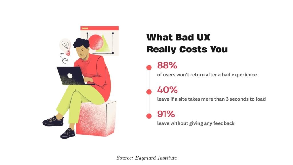
Even when that intent is not fully defined, users expect clarity and direction almost instantly. In fact, studies show that 88% of users won’t return after a poor experience, which highlights how quickly unmet expectations can turn into lost opportunities.
Good UX starts by recognising that user intent is not fixed, and it should not be treated with rigid design patterns or assumptions. It is about understanding what users need in that moment and removing any friction that slows them down or creates doubt.
The brands that perform best make this feel natural by answering key questions at the right time, creating an experience that feels clear, consistent, and easy to move through.
First Impressions Fade Faster Than You Think
While it is true that users form opinions about websites within milliseconds, those initial impressions are extremely fragile and can change almost instantly when usability issues appear.
A website might look polished at first glance, but if users struggle to find relevant information or understand how to move forward, their perception shifts from admiration to frustration.
Studies show that a large percentage of users are unlikely to return after a poor experience, which makes it clear that first impressions only matter if they are supported by seamless usability.
Poor UX Quietly Kills Conversions
Many businesses assume that low conversions are the result of weak marketing strategies or insufficient traffic, but in many cases, the real issue lies within the user experience itself.
When users encounter friction during their journey, whether it is complicated forms, unclear messaging, or broken flows, they tend to abandon the process without hesitation.
Research suggests that companies can lose a substantial portion of their revenue due to poor UX, which means that even high-performing marketing campaigns cannot compensate for a frustrating on-site experience.
Speed Is No Longer Optional
Website speed plays a critical role in shaping user perception, yet it is often treated as a secondary priority during development and design.
Modern users expect instant access to information, and even a delay of a few seconds can significantly increase bounce rates and reduce engagement.
When a website loads slowly, users are more likely to assume that the entire experience will be inefficient, prompting them to leave and seek faster alternatives that better meet their expectations.
Visual Excellence Can Start Hiding UX Flaws
High-end visuals can sometimes cover up deeper usability issues that only appear once users start interacting with the site. Animations may feel smooth but slow down progress, layouts might look immersive yet make navigation harder, and storytelling can delay the answers users are actively searching for. Motion adds richness, but if not handled carefully, it can compete with clarity instead of supporting it.
Individually, none of these elements feel like a problem, and the overall experience may still appear premium at first glance. However, users take longer to make decisions, and small moments of friction begin to add up where the journey should feel effortless.
This is not a criticism of expressive design, especially since it is something we value deeply at Big Bash Studio. It is simply a reminder that creativity works best when it is supported by a strong and thoughtful structure underneath.
When Atmosphere Becomes the Experience
A strong example of this done right is when a website is designed not to rush users toward immediate action, but to build belief and credibility over time. In certain industries, especially those driven by visual craft and perception, the goal is not speed but impact, where users need to understand the quality, scale, and confidence behind the work before making any decision.
In such cases, the experience is intentionally shaped to support that intent through cinematic pacing, immersive transitions, and carefully managed friction that encourages users to slow down and engage more deeply. Structure still exists beneath the surface, providing just enough clarity and orientation to guide users, while the atmosphere reinforces trust and elevates perception.
In this context, immersion is not working against UX but becoming a core part of it, aligning with what users expect when they arrive. The problem only begins when this style is replicated without purpose, where websites demand patience without offering clarity, or focus on atmosphere before establishing trust.
The Goal Isn’t to Strip Everything Back
Visual quality still matters because it shapes perception, builds credibility, and sets the tone for how users experience a website. Some experiences are intentionally immersive, slowing users down to create anticipation and help them understand value before taking action.
Problems arise when users are asked for patience before being given clarity, or emotional investment before trust is established. When structure and intent are clear, expressive design strengthens the experience rather than distracting from it. The strongest websites successfully balance both.
Poor UX Breaks Trust Before You Say a Word
Trust is built in moments, and often through interaction rather than what a brand claims. Users quickly notice whether a website responds as expected, feels consistent, and guides them without friction or confusion. When these signals feel unstable, users rarely analyse the issue, they simply feel uneasy, and that hesitation often turns into a lack of confidence.
That is why products like Monzo connect so well with users, as the experience feels reliable, clear, and easy to follow. Information is communicated simply, and visuals support that clarity rather than distracting from it. Trust is not declared, it is felt through every interaction.
Performance Is UX, Not Just Technical
Speed is not something users actively think about, but it is something they immediately notice when it falls short of expectations. A slow-loading site disrupts flow, increases effort, and creates subtle friction that affects how users feel about the entire experience.
Even small delays can introduce doubt and negatively shape brand perception, and no amount of visual polish can fully compensate for that frustration. Brands like Amazon recognised early on that improving performance leads to real business impact, not by changing how a site looks, but by reducing hesitation and making interactions feel seamless.
In reality, performance influences user experience more directly than most design decisions ever will.
UX Determines Whether Strategy Actually Works
Even the strongest positioning and messaging only succeed when users can experience them clearly and without friction. If people struggle to find proof, understand the offer, compare options, or move forward with confidence, then even the best strategy remains theoretical rather than effective.
We have seen this across multiple projects where the brand thinking was solid, but the experience layer failed to support it properly. In one case, meaningful results came not from redesigning visuals, but from simplifying navigation, aligning it with real user intent, improving structure, and reducing unnecessary steps.
Conversions improved early, long before any final visual polish was applied.
Great UX Feels Effortless and Obvious
The most effective user experiences rarely call attention to themselves, because they simply work the way users expect them to. They feel intuitive, consistent, and easy to navigate, so much so that, in hindsight, every interaction seems obvious and natural rather than designed.
Think about platforms like Netflix, where you rarely notice the interface itself because your focus stays on what you want to achieve, not how the system works. The experience supports the outcome without getting in the way or demanding attention.
When performance drops, many teams rush toward visual changes, adding new layouts, animations, or branding elements, which often only address surface-level issues. A more effective approach is to first understand user intent, simplify the journey, remove friction, and improve responsiveness, then enhance the visuals.
Final Thoughts
A visually strong website should do more than just capture attention, it should keep users engaged, build trust, and guide them toward meaningful action. When design and user experience work together, the result is not only appealing but also effective in delivering real outcomes.
If a website looks impressive but fails to perform, the issue is rarely the aesthetics themselves. The more important question is how the experience functions for users in real moments, how it flows, responds, and supports decisions according to ux trends. That is where true performance is shaped, gradually and often unnoticed.