
Most startup websites don’t fail because of bad ideas, they fail because the website doesn’t do its job. You might have a clean design, a decent logo, and even traffic coming in, but if users don’t understand what you do, don’t trust you, or don’t know what to do next, you lose them within seconds.
In 2026, attention spans are shorter, competition is sharper, and expectations are higher than ever. A startup website isn’t just a digital presence anymore — it’s your first sales pitch, your credibility check, and your conversion engine all in one. That’s why getting the fundamentals right is not optional. It’s non-negotiable.
What should a startup website include to actually convert?
From what we’ve seen working closely with scaling startups, conversion isn’t a design problem — it’s a clarity problem. In fact, research by NNGroup (Nielsen Norman Group) shows users typically leave a webpage within 10–20 seconds if they don’t quickly understand its value. That means your website needs to do three things almost instantly: communicate what you offer, establish credibility through proof, and guide users toward a clear next step — all without making them stop and figure things out.
Why do most startup websites fail to generate leads?
In most cases, it’s not a traffic problem — it’s a strategy problem. Startups often invest heavily in visuals but overlook user intent. The result? A website that looks impressive but doesn’t address user concerns, build confidence, or push visitors toward meaningful action.
What makes a high-converting startup website in 2026?
If you break it down, high-converting websites today are built around user behavior, not just design trends. They combine fast performance, clear messaging, trust signals, and structured journeys that make it easy for users to understand, engage, and ultimately take action without friction.
Top 5 Non-Negotiable Website Design Features Every Startup Needs in 2026
These features are not trends or optional upgrades — they are the baseline for any startup that wants to compete seriously.
If even one of these is missing, your website risks becoming a passive brochure instead of a growth engine.
1. A Crystal-Clear Value Proposition Above the Fold
The first few seconds on your website aren’t about design — they’re about understanding. When someone lands on your homepage, they’re subconsciously asking, “Is this for me?” If your messaging makes them pause, decode, or scroll to figure it out, you’ve already introduced friction.
A strong above-the-fold section removes that friction instantly. It doesn’t try to sound clever — it tries to be understood. The startups that win here are the ones that communicate outcomes, not features. Think less “innovative solutions” and more “what problem do you solve and for whom.”
What’s often underestimated is how quickly this judgment happens. Users form impressions almost instantly, and clarity becomes your competitive edge. Brands like Slack didn’t just grow because of product — they grew because their messaging made immediate sense. No ambiguity, no effort required from the user.
2. Conversion-Focused Call-to-Actions (Not Just Buttons)
Let’s be honest — most startup websites treat CTAs like decoration. Either they’re scattered everywhere hoping something works, or they’re so passive that users don’t even notice them. But a good CTA isn’t just a button — it’s a decision trigger.
A well-designed website anticipates where a user is in their journey and nudges them accordingly. Someone exploring your homepage doesn’t need the same push as someone reading your product details. This is where contextual CTAs change the game — they guide instead of interrupt.
Dropbox is a classic example of this restraint. By simplifying their homepage to focus on a single primary action, they reduced decision fatigue and increased sign-ups. It’s a reminder that clarity doesn’t just apply to messaging — it applies to actions too. The easier you make the next step, the more likely users are to take it.
3. Trust Signals That Instantly Reduce Doubt
If there’s one invisible barrier every startup faces, it’s skepticism. Users don’t just evaluate what you offer — they evaluate whether they can trust you. And in the absence of a known brand, your website has to do that heavy lifting.
This is where trust signals stop being “nice-to-have” and become essential. It’s not about adding logos or testimonials randomly — it’s about strategically placing proof where users naturally hesitate. Right before a decision point, right where doubt creeps in.
Research consistently shows that people trust other people more than brands. That’s why even a single, specific testimonial — one that feels real and relatable — can outperform generic marketing claims. It shifts the narrative from “we say we’re good” to “someone like you has already experienced value.”
And that shift is powerful.
4. Mobile-First Experience (Not Just Responsive Design)
Here’s where many startups unintentionally fall behind — they design for desktop comfort, then compress everything into mobile. But users don’t experience your website that way. For most of them, mobile is the primary experience.
Designing mobile-first forces better decisions. It prioritizes what truly matters, strips away unnecessary elements, and creates a more focused journey. It also aligns with how users actually behave — quick browsing, limited attention, and thumb-driven navigation.
- Prioritize content hierarchy for smaller screens
- Keep navigation simple and intuitive
- Ensure CTAs are easy to tap without effort
- Avoid overcrowding with unnecessary elements
With mobile traffic dominating globally, this isn’t just a design preference — it’s a performance factor. Startups that get this right don’t just look better on mobile, they convert better.
5. Speed and Performance That Support User Experience
Speed is one of those things users rarely notice — until it’s a problem. And when it is, it doesn’t matter how good your design is. A delay of even a few seconds can quietly undo all the effort you’ve put into messaging, layout, and flow.
But beyond the technical side, speed shapes perception. A fast website feels reliable, modern, and trustworthy. A slow one creates subtle doubt — even if users can’t explain why.
There’s also a direct business impact here. Data shows that more than half of users abandon websites that take longer than a few seconds to load. That’s not just a UX issue — that’s lost opportunity.
The smartest startups treat performance as part of the experience, not an afterthought. Because in a competitive landscape, even small delays can mean losing users to someone faster, sharper, and easier to engage with.
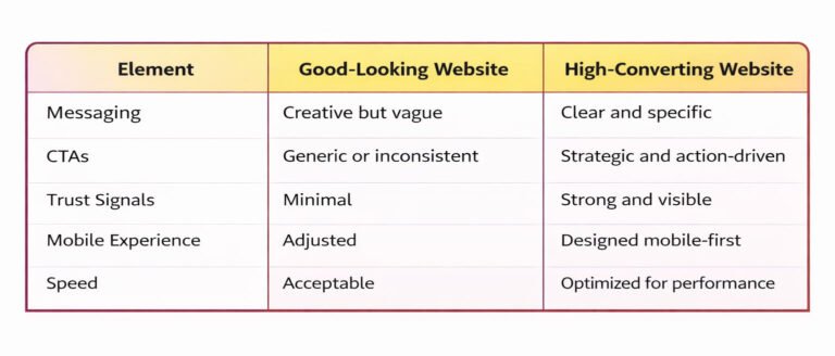
High-Converting Website Design Elements Compared to Traditional Website Design
Startup Website Checklist (Non-Negotiables)
Before you overthink design trends or add more features, it helps to step back and check whether the fundamentals are actually in place. Most high-performing startup websites don’t succeed because they have more — they succeed because they get the basics absolutely right.
Use this quick checklist to evaluate whether your website is built to perform, not just exist:
- Clear value proposition above the fold (users understand what you do instantly)
- Strong primary CTA visible without scrolling
- Testimonials or trust signals that reduce hesitation
- Mobile-first optimized layout (not just responsive, but designed for mobile)
- Fast loading speed (ideally under 3 seconds)
If you can confidently check all five, you’re already ahead of most startups. If not, those gaps are likely where your conversions are leaking.
Where Most Startups Get Stuck (And What Actually Works)
At this stage, most founders already understand what a “good website” should include. The real issue isn’t awareness — it’s execution. Bringing together clarity, conversion, trust, and performance into one seamless experience is where things start to fall apart.
You’ll often see startups with all the right pieces in isolation. A strong headline here, a decent CTA there, maybe even testimonials added somewhere down the page. But when these elements aren’t strategically connected, the website feels fragmented — and users feel it too.
What looks complete on the surface often lacks direction underneath. And that’s why many startup websites end up underperforming despite looking “good enough.”
How Big Bash Studio Approaches It Differently
At Big Bash Studio, the focus isn’t on adding more design elements — it’s on aligning the right ones to drive results.
Instead of treating design, content, and UX as separate layers, the approach is built around how users actually think and behave. Every decision — from layout to messaging — is tied back to one question: does this move the user closer to action?
- Clarity is prioritized over creativity when it comes to messaging
- Structure is designed around user flow, not just visual balance
- Trust elements are placed where hesitation naturally occurs
- Mobile experience is treated as the primary journey, not an afterthought
- Performance is considered part of design, not a technical add-on
This philosophy shifts the focus from just “having a website” to implementing non-negotiable website design features that directly drive growth and performance.
Final Thoughts
If you’re building or redesigning your startup website, don’t start with colors or layouts — start with how it should perform.
Stay aligned with evolving Ui/UX trends, explore modern AI branding tools, and focus on affordable design approaches that still deliver measurable impact. And if execution feels scattered, partnering with a reliable design agency can help bring clarity, structure, and performance together.
Because in the end, your website isn’t just something people visit — it’s something that should move them to act.