
In 2026, color trends are getting bolder, stranger, and smarter, and brands that embrace unexpected combinations will stand out faster. Let’s break down the color pairings driving brand impact this year.
Color is one of the most powerful tools in branding, yet many businesses still rely on predictable palettes that blend into the background. In a digital world filled with visual noise, unexpected color combinations have become a strategic way for brands to capture attention, communicate personality, and stay memorable.
At Big Bash Studio, we approach color as more than decoration. Every shade, contrast, and pairing plays a role in how a brand is perceived. When bold color combinations are used intentionally, they can transform ordinary visuals into distinctive brand experiences.
This guide explores how unconventional color palettes work, why they resonate with modern audiences, and how brands can apply them effectively across digital and visual design.
Why Unexpected Color Combinations Matter in Branding
We live in a visually saturated world. Every day, people are exposed to thousands of brand messages across websites, apps, billboards, and social feeds. Most of them look similar. Same layouts. Same fonts. Same color palettes.
Color is often the first thing people notice before they read a single word. It sets expectations instantly. It communicates mood, energy, and intent in seconds. When a color combination feels unexpected, the brain pauses. That pause is powerful. It creates engagement.
Unexpected color pairings work because they challenge visual habits. They introduce contrast where people do not expect it. That contrast creates memorability, which is the foundation of strong branding.
The Psychology Behind Bold Color Combinations
Before experimenting with unusual combinations, it is important to understand how color influences perception. Every color carries emotional weight shaped by culture, experience, and psychology.
Warm colors like red, orange, and yellow often feel energetic, bold, and expressive. Cool colors like blue, green, and purple tend to feel calming, stable, or thoughtful. Neutral tones provide balance and breathing space.
Unexpected combinations usually work by mixing emotional opposites. Calm meets energy. Soft meets bold. Modern meets nostalgic. When done right, this tension creates depth instead of confusion.
The goal is not to shock for the sake of it. The goal is to create a feeling that aligns with the brand story while still feeling fresh.
Why Safe Color Palettes No Longer Work for Modern Brands
Many brands choose colors based on industry norms. Tech companies lean blue. Finance goes dark and conservative. Wellness brands stick to muted greens and beiges.
While these choices feel safe, they also limit differentiation. When every brand in a category looks the same, color stops being a competitive advantage.
Unexpected color combinations allow brands to stand out without changing their message. The product can remain serious, trustworthy, or premium while the color palette introduces personality and distinction.
This is especially important for digital-first brands competing for attention in crowded spaces.
6 Unexpected Color Combinations That Will Define 2026 Branding Trends
Unconventional does not mean random. The most effective unexpected color combinations are rooted in balance, contrast, and intention. Below are combinations that can consistently perform well in 2026 across branding, web design, packaging, and digital campaigns.
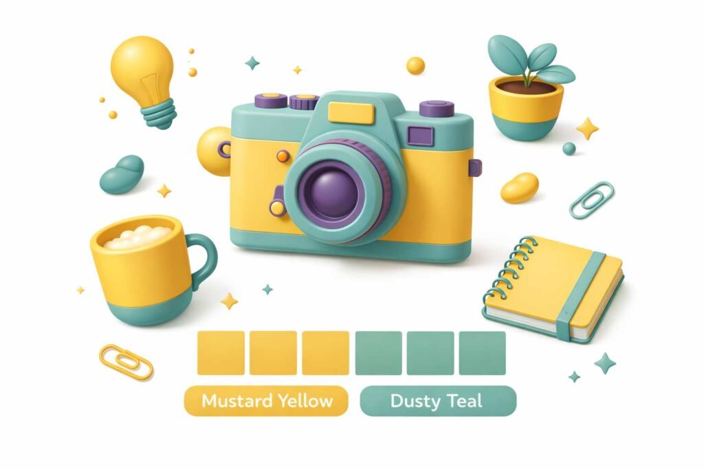
1. Mustard Yellow and Dusty Teal
This pairing brings together warmth and calm in a way that feels both nostalgic and modern. Mustard yellow adds character and optimism, while dusty teal grounds the palette with sophistication.
Together, they feel creative without being chaotic. This combination works well for brands that want to feel expressive but mature. It is especially effective in editorial design, lifestyle branding, and creative agencies.
The key is balance. Use mustard as an accent and teal as a foundation to avoid overwhelming the viewer.
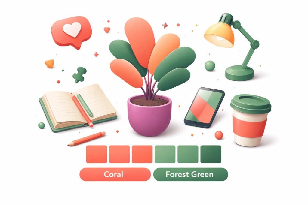
2. Coral and Forest Green
Coral is playful, friendly, and energetic. Forest green is deep, stable, and grounded. When combined, they create a contrast that feels organic and refreshing.
This pairing works beautifully for brands focused on growth, wellness, sustainability, or innovation. Coral draws attention, while green reassures.
It is an excellent choice for brands that want to appear approachable without losing credibility.
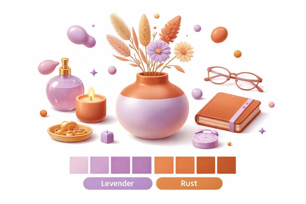
3. Lavender and Rust
Soft and earthy rarely meet, but when they do, the result is surprisingly refined. Lavender brings calm and creativity, while rust adds warmth and texture.
This combination feels artistic and thoughtful. It works particularly well for beauty brands, creative studios, boutique products, and storytelling-focused designs.
The contrast feels emotional rather than aggressive, making it ideal for brands that value expression and individuality.
4. Electric Blue and Ochre
This is a high-energy pairing with strong visual tension. Electric blue feels futuristic and bold, while ochre adds an earthy, almost vintage counterbalance.
Together, they create a palette that feels confident and intentional. This combination works well in fashion, digital products, and bold marketing campaigns.
The trick here is hierarchy. Let one color lead and the other support. When balanced properly, the result feels dynamic rather than overwhelming.
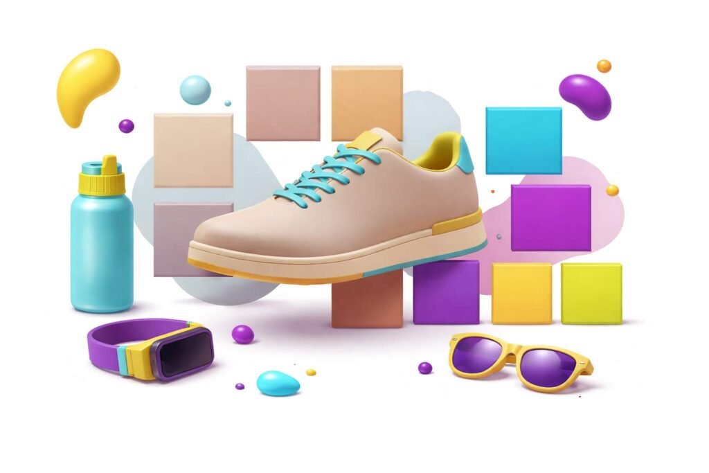
5. Neutral Beige with Neon Accents
Neon colors can be intimidating, but when paired with soft neutrals, they become powerful tools instead of distractions. Beige, cream, or light gray create a calm base that allows neon accents to shine.
This approach is perfect for modern brands targeting younger audiences or digital platforms. It allows flexibility and scalability across multiple touchpoints.
Neon should always be used sparingly. Think highlights, calls to action, or key visual elements rather than full backgrounds.
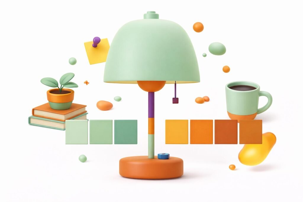
6. Mint Green and Burnt Orange
Mint green feels fresh, approachable, and modern. Burnt orange feels warm, nostalgic, and grounded. Together, they strike a balance between playfulness and depth.
This combination works well for lifestyle brands, food and beverage, creative startups, and brands inspired by retro or mid-century aesthetics.
It is friendly without being childish and bold without being loud.
How Big Bash Studio Uses Bold Color Combinations Without Hurting Usability
At Big Bash Studio, we never choose colors in isolation. Every palette is designed around a brand’s personality, audience, and goals.
Our process starts with understanding the brand story. What emotions should people feel? What action should they take? What makes the brand different?
From there, we test color combinations in real contexts. Websites, social media, packaging, and interfaces. Colors behave differently on screens than on paper. They shift under different lighting and contrast conditions.
Unexpected combinations only work when they support usability, readability, and consistency.
6 Practical Tips for Using Unexpected Color Palettes
- Bold color experimentation should always be guided by structure. Here are some practical principles to follow.
- Start with a strong base color that represents the brand. Introduce the unexpected color as a secondary or accent tone.
- Always test contrast to ensure accessibility. Text and key elements must remain readable across devices.
- Use whitespace intentionally. Bold colors need room to breathe.
- Apply the palette consistently across touchpoints. Inconsistency weakens impact.
- Tone matters. If a combination feels too intense, soften one color rather than abandoning the idea entirely.
Common Mistakes to Avoid
- Not every bold combination works. Some mistakes can undermine even the most creative ideas.
- Using too many strong colors at once creates confusion rather than clarity.
- Ignoring cultural context can lead to unintended meanings or emotional responses.
- Forcing bold colors into conservative brand personalities can feel inauthentic.
- Following trends without strategy leads to short-lived impact.
- Unexpected should still feel intentional. When colors feel random, trust erodes.
Color as a Brand Signature
Some of the most iconic brands are instantly recognizable by color alone. That recognition does not come from playing it safe. It comes from commitment.
Unexpected color combinations can become a brand signature when used consistently and confidently. Over time, what once felt unusual becomes familiar and owned.
This is where long-term brand thinking matters. Color is not a one-time decision. It is an evolving system that grows with the brand.
Final Thoughts
Unexpected color combinations are not about breaking rules for attention. They are about rethinking how brands communicate visually in a crowded world.
When used thoughtfully, bold color pairings can elevate a brand, tell deeper stories, and create lasting emotional connections.